Achieving a blockbuster, cinematic look in photography and design demands more than just slapping on a filter. True color grading is a disciplined art form that blends technical precision with creative intuition. In this guide, we unpack a four-step workflow—ranging from bit-depth preparation to advanced color separation—that empowers you to craft images with the depth, mood, and tonal richness reminiscent of your favorite films.
Preparing Your Canvas: Embrace 16-Bit Precision
The journey to cinematic-grade imagery begins with setting your document’s bit depth to 16 bits per channel. Unlike 8-bit mode, which allocates only 256 tonal steps per channel, 16-bit mode expands that to over 65,000 steps—virtually eliminating banding in smooth gradients like skies or skin tones. To switch, navigate to Image > Mode > 16 Bits/Channel. This upfront investment in data fidelity pays dividends during aggressive color manipulations, ensuring transitions remain fluid and artifact-free.
Foundational Corrections: Nail Exposure & White Balance
Before any creative grading, your image must be technically sound. Start with Exposure and White Balance adjustments to anchor your tonal range. Use Camera Raw or Lightroom to correct raw files, then switch to Photoshop for refined control:
- Exposure & Contrast: Tame blown highlights and lift clipped shadows using the Curves or Levels adjustment layers.
- White Balance: Sample neutral tones with the Eyedropper tool, or dial in presets (Daylight, Tungsten) for mood consistency.
- Highlight & Shadow Recovery: Leverage Highlights and Shadows sliders in Camera Raw, then refine with targeted masks in Photoshop.
These baseline corrections create a neutral canvas for your LUTs, ensuring that subsequent looks aren’t fighting residual color casts.
Applying LUTs with Finesse
LUTs (Look-Up Tables) translate one set of colors to another, acting as sophisticated presets. There are three main categories: technical LUTs for color-space conversion, creative LUTs for stylized looks, and camera-specific LUTs tailored to particular sensor profiles.
To apply:
- Create a Color Lookup adjustment layer.
- Choose a
.cubeor.3dlLUT file aligned with your creative vision. - Reduce the adjustment layer’s opacity to somewhere between 30–70%, dialing back intensity until the effect feels organic.
For more nuanced applications, stack multiple LUTs: use a technical LUT for gamma correction followed by a creative LUT for mood. Mask selectively to preserve natural flesh tones or architectural integrity.
Advanced Color Separation: Sculpt Highlights & Shadows
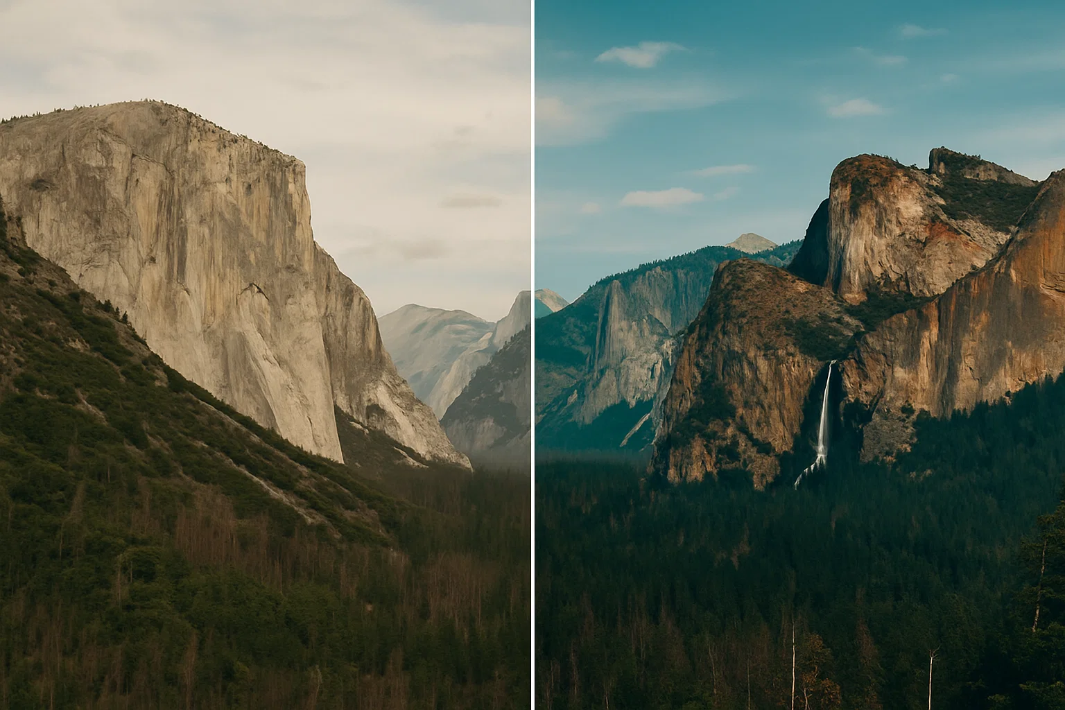
Color separation elevates your image by assigning distinct tonal colors to highlights, midtones, and shadows—a hallmark of blockbuster cinematography. The classic “orange-and-teal” scheme is merely one flavor; you can explore any complementary pairing to reinforce emotion or narrative.
Two methods stand out:
Method A: Channel-Specific Curves
- Add a Curves adjustment layer.
- Select the Red channel: raise highlights & lower shadows for a warm hue.
- Switch to Blue: boost shadows & tame highlights for cooler depths.
- Fine-tune the Green channel for neutral balance.
Method B: Targeted Hue/Saturation Layers
- Create two Hue/Saturation adjustment layers—one clipped to highlights, the other to shadows.
- Set the first layer’s mask to target light areas, then shift Hue toward warm oranges or yellows.
- On the second layer, mask dark regions and pivot Hue toward blues or greens.
- Blend and adjust opacity until the dichotomy feels cinematic yet natural.
Avoiding Common Pitfalls
Even seasoned pros can stumble when chasing cinematic effects. Watch out for:
- Over-Saturation: Excessive color intensity reads as artificial. Aim for subtle shifts.
- LUT Overdrive: Full-opacity LUTs often crush midtones and obliterate skin detail. Always dial back opacity.
- Banding: Forgetting 16-bit preparation can introduce harsh gradients, especially in skies or smooth surfaces.
- Flat Contrast: Skipping foundational corrections leaves LUTs nothing to lock onto, resulting in a lackluster image.
Integrating Into Your Creative Pipeline
To scale this workflow across large projects or teams, automate repetitive tasks and standardize your tools:
- Photoshop Actions: Record your four-step process as an action for one-click application across multiple images.
- Batch Processing: Use Image Processor Pro or Bridge to apply LUTs and export JPEG/PNG variants in bulk.
- Cross-Application Workflows: Pair Photoshop with Premiere Pro or DaVinci Resolve—export adjustment-layer LUTs for consistent grading across photo and video edits.
- Keyboard Mastery: Speed up navigation by learning essential shortcuts. Check out our Ultimate Guide to Adobe Illustrator Keyboard Shortcuts for overlapping Photoshop tips.
Essential Tools & Resources
Equip yourself with the right resources to refine your craft:
- Calibration Hardware: Invest in a display calibrator (X-Rite i1Display Pro or Datacolor Spyder) to ensure color accuracy.
- LUT Libraries: Explore marketplaces like LUTify.me and FilterGrade for high-quality creative LUT packs.
- Learn Advanced Shortcuts: Boost efficiency with the Top 10 Photoshop 2025 Keyboard Shortcuts Every Designer Should Know.
- Film References: Study your favorite movies’ color scripts on sites like ShotDeck to reverse-engineer iconic looks.
Conclusion: Elevate Your Visual Storytelling
By rigorously applying this four-step color grading workflow—16-bit preparation, foundational corrections, nuanced LUT application, and advanced color separation—you’ll gain full creative control and deliver striking, filmic visuals. Embrace experimentation: tweak hues, swap complementary pairs, and iterate until the mood resonates with your narrative. With disciplined technique and artistic daring, your images will command attention and convey story in every pixel.