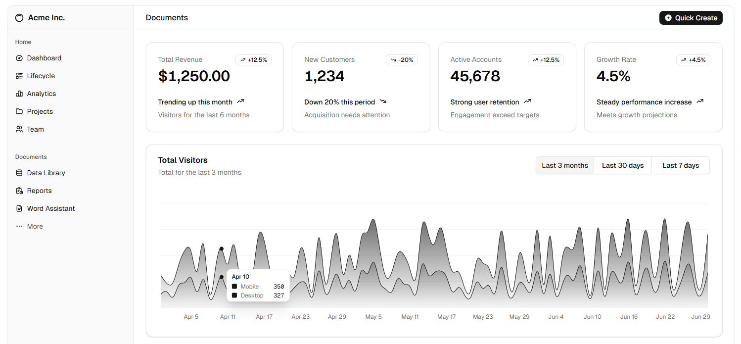
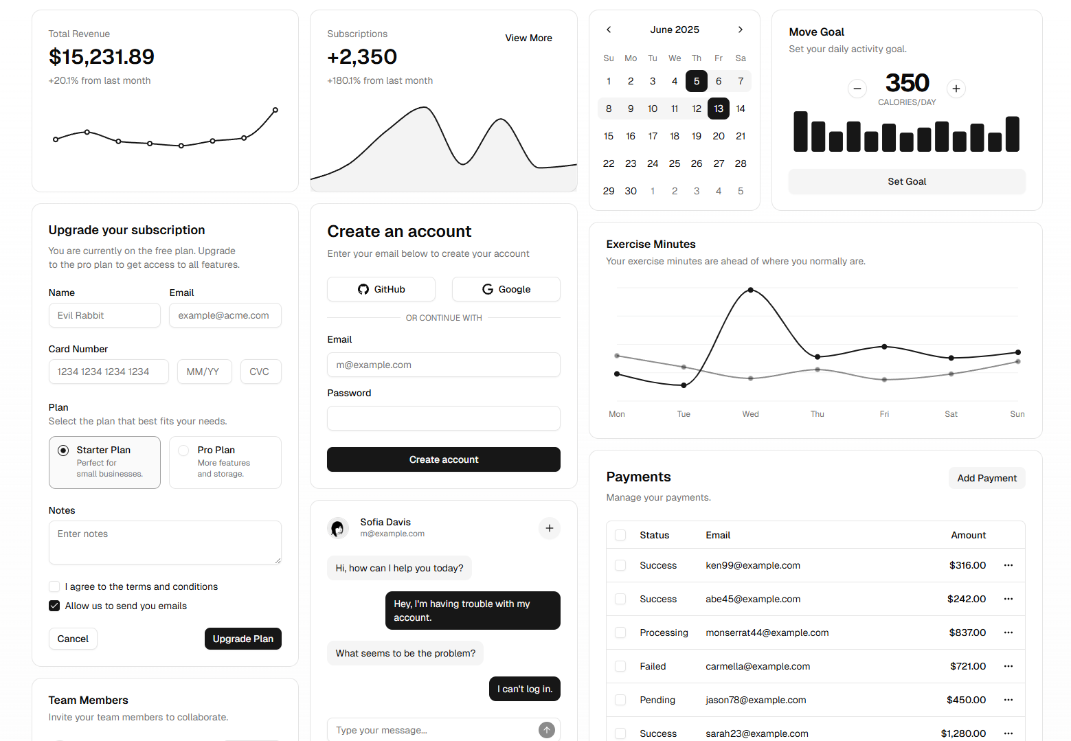
In today’s fast-paced digital landscape, designers face mounting pressure to deliver visually stunning, highly accessible, and performance-optimized interfaces—in record time. The Shadcn UI framework emerges as a game-changer, blending low-level design primitives with an opinionated, theme-driven architecture. By embracing Shadcn, teams can architect robust design systems that bridge the gap between design intent and production code, accelerating collaboration while maintaining pixel-perfect precision.

1. From Atomic Design to Production-Ready Components
The philosophy behind Shadcn UI borrows heavily from Brad Frost’s Atomic Design methodology: atoms (buttons, inputs), molecules (form fields, cards), organisms (navigation bars), templates, and pages. However, Shadcn injects a critical production focus by shipping these components with no runtime styling dependencies—only utility classes and CSS variables. This means your design tokens (colors, spacing, typography) propagate seamlessly across the codebase, ensuring that when a palette update is required, every button, modal, and dropdown inherits the new value instantly.
2. Bridging Designer–Developer Workflows
Traditional handoffs—sketch files, static prototypes, and mountains of comments—often leave developers guessing. Shadcn’s React components come baked with accessible markup and standardized props, enabling designers to specify spacing, states, and themes in code. When paired with vector asset exports from tools like Illustrator, your front-end team can import SVG icons and leverage the Ultimate Guide to Adobe Illustrator Keyboard Shortcuts to optimize asset workflows, reducing context switches and saving hours each sprint.
3. Accessibility as a First-Class Citizen
Accessibility shouldn’t be an afterthought—Shadcn builds on Radix UI primitives, which conform to strict WAI-ARIA standards. Components like dialogs, tooltips, and menus automatically handle focus management, keyboard navigation, and screen-reader announcements. This approach empowers designers to prototype truly inclusive interfaces without reinventing the wheel or writing boilerplate code, freeing them to focus on interactions and user flows.
4. Theming and Dark Mode by Design
With users increasingly expecting dark mode, Shadcn’s CSS-variable-driven theming makes toggles nearly effortless. A single JavaScript hook flips theme variables—from background and text colors to shadow intensities—across all components. Designers can mock both light and dark variants in Figma or Photoshop and use the Top 10 Photoshop 2025 Keyboard Shortcuts reference to craft polished mockups, then trust that production will mirror those visuals exactly.
5. Performance Without Compromise
Many component libraries incur hefty bundle sizes due to CSS-in-JS or theme parsing at runtime. Shadcn sidesteps this by leveraging Vite’s build pipeline: components import pure utility classes and CSS variables, enabling aggressive tree-shaking and zero-runtime stylesheet generation. The result is a leaner initial payload and near-instant page loads—a crucial KPI for both user satisfaction and search engine ranking.
6. Extending the Ecosystem with Design Tokens
Shadcn encourages you to define a central theme.ts (or JSON) file containing your brand’s color palette, typography scale, and spacing map. Teams can distribute these tokens via npm or a private registry, ensuring that the marketing site, admin portal, and design system library all share consistent values. When product managers request a new accent color, you update one file—and every usage across multiple repositories updates automatically.
7. Prototyping and User Testing
Rapid prototyping is key to gathering early feedback. Shadcn components work seamlessly with tools like Storybook and Playwright: you can spin up interactive component previews in isolation, test aria-attributes in CI, and record user sessions on new design patterns—all without writing glue code. This accelerates the feedback loop, letting designers validate hypotheses with real data before committing to full-scale development.

8. Collaboration Patterns for Distributed Teams
In a world of remote teams, clear documentation and shared context are vital. Shadcn ships with autogenerated MDX docs that include live code sandboxes, prop tables, and thematic guides. Designers and developers can comment directly in the documentation repo, propose token changes via pull requests, and maintain a changelog of design-system updates—creating an auditable history of every design decision.
9. Future-Proofing Your Design System
The migration risk associated with monolithic libraries can stall innovation. Shadcn is unopinionated about CSS frameworks—you can pair it with Tailwind CSS, Stitches, or vanilla CSS. As new styling technologies emerge, you can adapt your utility set without rewriting component logic. This decoupling future-proofs your system against shifting trends, ensuring your UI remains both cutting-edge and maintainable.
10. Conclusion: Elevate Your Design Workflow
Shadcn UI is more than a component library—it’s a convergence of modern design principles, accessible patterns, and performance best practices. By unifying design tokens, atomic components, and zero-runtime styling, it empowers teams to deliver cohesive, high-fidelity interfaces at scale. Whether you’re building an enterprise dashboard or a consumer-facing portal, Shadcn provides the blueprint for success: speed, consistency, and inclusivity—all in one elegant package.

 FoxDoo Technology


