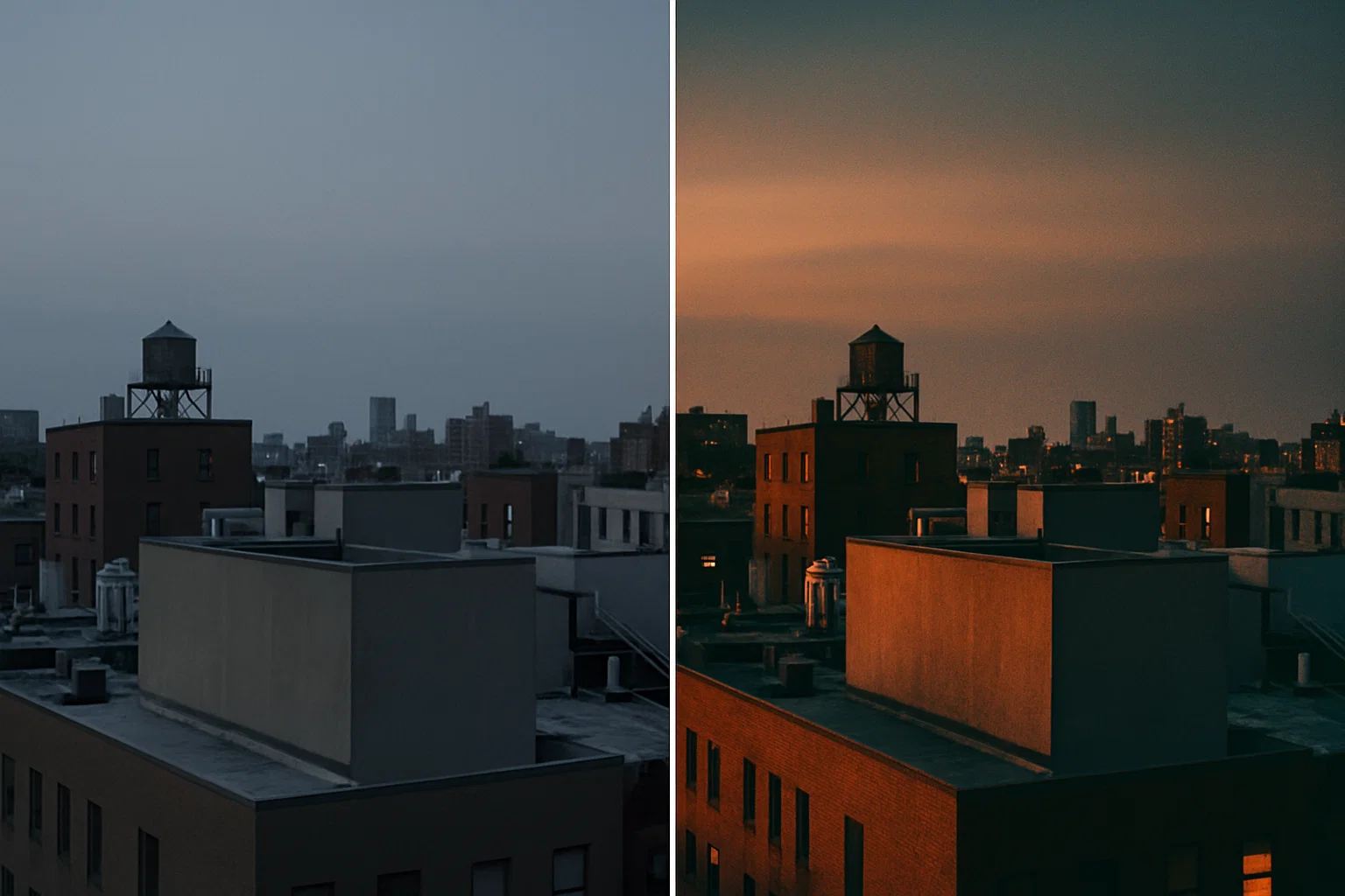
I still remember opening a dull, washed-out rooftop shot at two in the morning. Coffee gone cold. Brain kinda fried. But I was stubborn—I knew the frame had potential. Twenty minutes and one tonal-separation pass later, bam: the sky popped, the city lights hummed, and I felt like I’d rescued a hidden gem from the recycle bin. That tiny victory is why I’m writing this guide. Let’s talk real-world Photoshop magic—no fluff, no corporate jargon.
First Things First: What the Heck Is Tonal Separation?
In plain English, we split the image into brighter and darker chunks, then treat each chunk like its own mini canvas. Think of it as contouring for pixels. You can pump warmth into highlights, cool off shadows, or do the reverse for a vintage vibe. It’s fast, non-destructive, and frankly more controllable than chucking a one-size-fits-all LUT on top.
The Classic Four-Step Workflow (With a Tiny Twist)
- Duplicate the base layer. Shortcut
Ctrl/Cmd + J—no brainer. - Hit Levels (
Ctrl/Cmd + L). Tug the mid-tone slider to around 1.30. The frame darkens a bit; stay calm, that’s part of the plan. - Add a Gradient Map adjustment. Pick an orange-to-blue ramp, flip the blend mode to Soft Light, drop opacity near 40 percent.
- Fine-tune locally. A quick Curves nudge brings back shadow detail; a tiny Saturation dip (–10 to –15) prevents clown-makeup colors.
That’s the bones. You’ll refine values case-by-case, but this skeleton consistently turns “meh” into “whoa.”
Why It Works: A Nerdy but Useful Breakdown
Human vision loves contrast—not just light vs. dark, but warm vs. cool. Tonal separation hits both. By decoupling luminosity zones, you boost micro-contrast (the stuff that makes metal gleam and eyes sparkle) without crushing global contrast. Meanwhile, your warm-highlight / cool-shadow gradient teases out color depth the way Hollywood colorists finish a Marvel scene. Result? More perceived dynamic range and richer mood.
Going Deeper: Luma Masks, Blend-If, and Nested Groups
If you’re the tinkering type, swap the stock Gradient Map for a folder of Selective Color, Color Balance, and Curves layers, each masked by luminosity. The Blend-If sliders in Layer Styles let you feather adjustments strictly into highlights (drag the right black triangle while holding Alt/Option). Nested groups plus opacity-controlled masks give you per-zone flexibility—great for product photos where you want steely watch cases but neutral white faces.
Real-Life Use-Cases (and a Few Pitfalls)
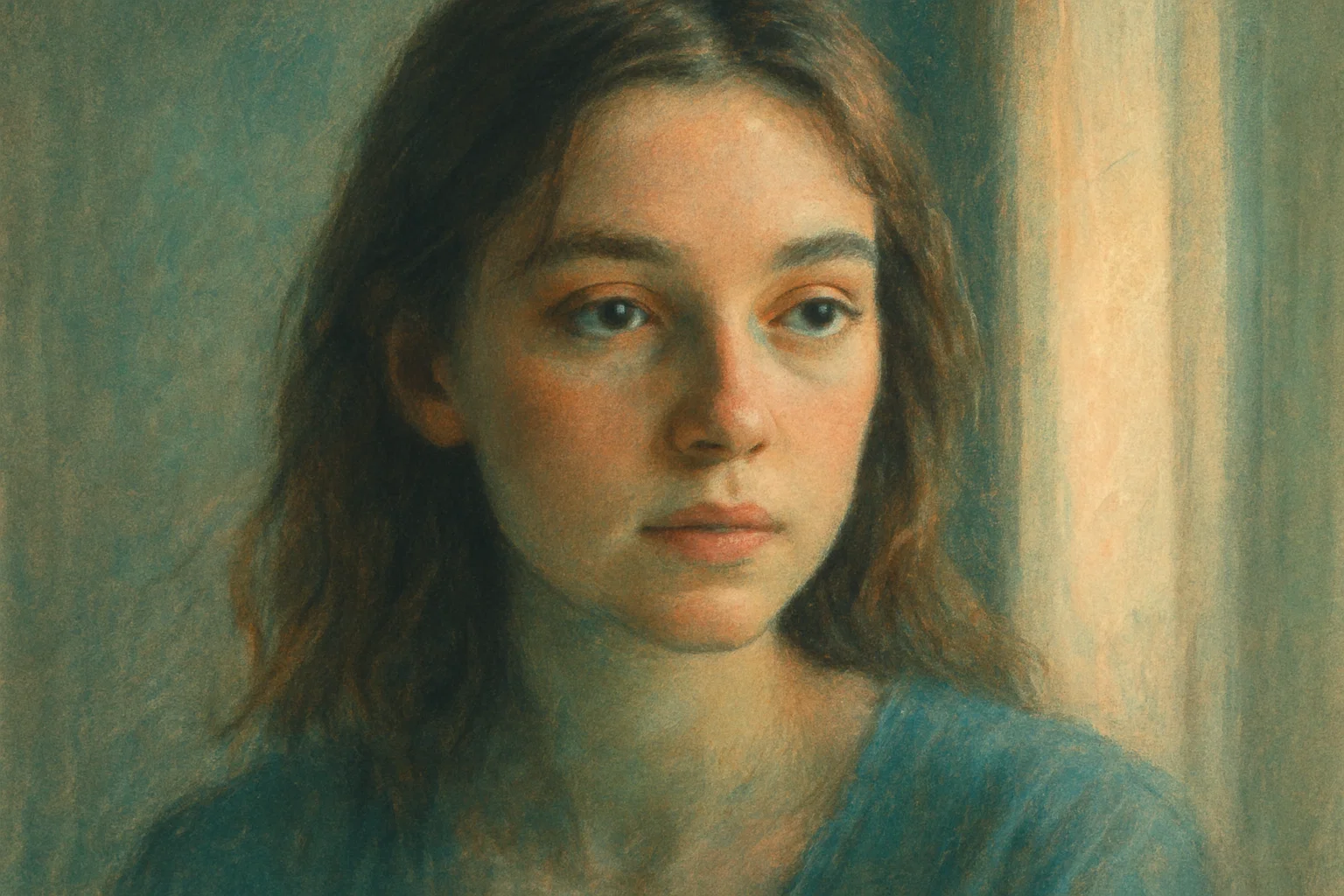
- Portraits: Warm skin in highlights, cool teal backdrops—hello cinematic headshot. But watch out for banding; 16-bit mode is your friend.
- Street: Orange street lamps vs. blue-violet asphalt? Chef’s kiss. Just mind color noise in the shadows.
- Food: Warm highlights sell “fresh-out-of-the-oven.” Overdo it and cheese turns radioactive.
- Architectural Renders: Split-tone glass reflections for cyber-punk vibes. Keep verticals straight; distortion + strong grading equals dizziness.
Tonal Separation in a Modern Workflow
I’m not grading in a vacuum. After Photoshop, my finished JPEGs take a pit-stop in
Mazanoke for local-first compression,
stripping EXIF bloat before the file hits a client’s CMS. That keeps page-speed scores healthy and privacy hawks happy.
Performance Matters: Don’t Let Pretty Pixels Kill Load Times
Heavy grading can inflate file sizes—especially when you’re saving in 16-bit TIFF for print. My rule of thumb:
- Export two masters: a giant archival copy and a web-optimized JPEG/WebP.
- Run a PS action that flattens adjustment layers, converts to sRGB, then kicks image straight into the Mazanoke PWA (yes, you can script it).
- For social, let Instagram’s recompression do its worst; just stay above 1800px on long edge to dodge crunchy artifacts.
Common Mistakes I Still See (and Occasionally Make)
Cranking Opacity to 100%: Looks slick at midnight, screams “Instagram filter from 2015” the next morning.
Ignoring Skin Tones: Cool shadows can turn melanin ashy. Throw a mask on faces; dial warmth back in.
Banding: 8-bit images plus heavy gradients equals ugly color steps. Switch to 16-bit before you even touch Levels.
Overlooking Print: That teal-orange contrast you love might crash in CMYK. Always soft-proof.
Advanced Flavor: Blend Modes Beyond Soft Light
Overlay punches harder, great for drama. Color leaves luminosity intact, handy for subtle hue shifts. Luminosity is underrated—it lets you nick contrast from a different photo and paste it on top like tonal Frankenstein. Don’t be afraid to stack modes; just group and label them so Future You isn’t cursing Past You.
Automating the Boring Bits
I keep a mini-panel of scripts: one builds a three-layer tonal stack, another toggles between warm-highlight/cool-shadow and cool-highlight/warm-shadow schemes. Actions shave seconds, but the real win is cognitive load—you focus on creative choices instead of hunting menus.
The Emotional Angle (because Art Isn’t Just Math)
Color grading isn’t purely technical. It’s about translating how a scene felt when you pressed the shutter. Was the city buzzing? Crank saturation in the highlights. Quiet dawn? Lean into pastel lows. Give yourself permission to bend reality—just tether it to an emotional truth so the viewer buys the illusion.
Quick Checklist Before You Ship
- Toggle the Gradient Map on/off fast—does the frame collapse or just lose polish? If the former, you went too far.
- Zoom to 100%: artifacts? banding? weird halos? Fix now, not after the client spots them.
- Print test on matte and gloss; watch for shadow detail plug-up.
- Mobile preview in daylight. Outdoor glare murders subtle color shifts.
Wrapping Up: Your Turn
Grab an old forgettable shot. Run the four-step recipe. Tweak until it whispers “cinema.” Share the before-and-after with a friend—better yet, drop me a DM with your proudest save. Tonal separation isn’t some gate-kept dark art; it’s a dependable, creative accelerant. And hey, if it rescued my 2 a.m. rooftop disaster, imagine what it can do for your next masterpiece.
Happy grading, and remember—imperfection is where the magic sneaks in.