 FoxDoo Technology
Tailwind CSS custom styles changed how I ship front-ends. A quick story: one late Friday I promised a client a dark-mode dashboard “by Monday.” I had a raw React app, a sketchy color palette, and way too much coffee. Twelve hours later—thanks to Tailwind’s theme.extend, a tiny plugin, and a couple of @layer utilities—that dashboard looked like a product. Not a prototype. Since then, my rule is simple: keep styles composable, automate the boring parts, and make it easy for teammates to do the right thing without thinking.
This guide follows that mindset. We’ll mirror a practical structure you can follow step-by-step: integrate Tailwind in React, understand the core directives, extend the theme, create reusable component classes, write and package plugins, add responsive primitives, introduce cva for variants, and wrap with optimization tips. Along the way, I’ll sprinkle patterns that keep your codebase tidy when the team—and requirements—grow fast.
1) Integrate Tailwind CSS into a React project
First moves matter. A clean integration sets the tone for everything else you’ll do with Tailwind CSS custom styles.
Install and scaffold. For a Vite + React app:
npm install -D tailwindcss postcss autoprefixer npx tailwindcss init -p You’ll get tailwind.config.js (or .ts) and postcss.config.js. Enable JIT (default) by declaring your content paths so unused classes get purged from builds:
// tailwind.config.ts import { defineConfig } from 'tailwindcss/helpers'

export default defineConfig({
content: ['./index.html','./src/**/*.{js,ts,jsx,tsx}'],
theme: { extend: {} },
plugins: [],
})
Wire styles. Create a global stylesheet and pull in Tailwind’s layers:
/* src/index.css */ @tailwind base; @tailwind components; @tailwind utilities; Finally, import the CSS in your React entry:
// src/main.tsx import React from 'react' import ReactDOM from 'react-dom/client' import App from './App.tsx' import './index.css'

ReactDOM.createRoot(document.getElementById('root')!).render()
That’s your “zero to render” path. From here, every improvement to Tailwind CSS custom styles compounds.
2) The core directives: @tailwind base, @tailwind components, @tailwind utilities
These three words are deceptively powerful. They define how styles cascade and where your customizations belong.
@tailwind baseresets/normalizes and sets global primitives (typography, forms). It gives you consistent footing across browsers.@tailwind componentsis for reusable “lego” parts like cards, buttons, alerts. We’ll stack our@layer componentshere.@tailwind utilitiesexposes the atomics (p-4,grid,bg-blue-600) you’ll use 100 times a day.
Think of it like this: base is the soil, components are seedlings you nurture, and utilities are your gardening tools. Mastering this layering is how Tailwind CSS custom styles stay clean under pressure.
3) Importing styles in your React entry: the tiny detail that prevents weird bugs
It’s easy to forget ordering. Keep your project simple: import index.css exactly once in the root. Avoid pulling Tailwind in per-component unless you know why. This prevents conflicting cascades and makes build graphs predictable. When something looks “off” on only one route, 90% of the time it’s mismatched layers or duplicated imports.
4) Customization methods you’ll use every week
Here’s the shortlist that actually scales Tailwind CSS custom styles in real apps.
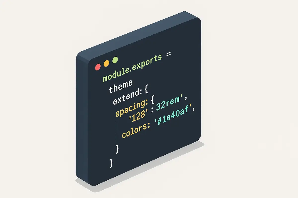
4.1 Extend the theme with theme.extend (your single source of truth)
Centralize tokens—colors, spacing, fonts, breakpoints—so your team stops inventing shades of blue on the fly.
// tailwind.config.ts (excerpt) export default { theme: { extend: { colors: { brand: { 50:'#f5f7ff', 500:'#3c5cf1', 600:'#2f49c4', 900:'#0f1a56' }, danger: '#e11d48', }, spacing: { '72':'18rem', '84':'21rem' }, fontFamily: { inter: ['Inter','ui-sans-serif','system-ui'] }, } } } With tokens in place, design reviews get shorter. “Use brand-600” is unambiguous. You’ll feel the payoff every time a new teammate ships a UI that already looks on-brand.
4.2 Create component classes with @layer components (legos, not snowflakes)
When a pattern stabilizes, move it out of JSX into a named class. Now it’s discoverable and harder to accidentally fork.
/* src/index.css */ @layer components { .btn { @apply inline-flex items-center gap-2 font-semibold rounded-lg transition; } .btn-primary { @apply btn bg-brand-600 text-white hover:bg-brand-500 active:scale-[.98]; } .card { @apply bg-white dark:bg-zinc-900 rounded-2xl shadow p-6; } } In JSX:
<button className="btn btn-primary">Save changes</button> <article className="card">...</article> That’s Tailwind CSS custom styles at their best—utility-first for speed, with component classes for repeatability.
4.3 Use official plugins and your own
Install a couple that almost always pay off:
npm i -D @tailwindcss/typography @tailwindcss/forms// tailwind.config.ts plugins: [ require('@tailwindcss/typography'), require('@tailwindcss/forms'), ] Typography cleans up long-form content; Forms makes inputs sane across browsers. Both keep Tailwind CSS custom styles consistent without yak-shaving.
5) Authoring a Tailwind plugin (from zero to useful)
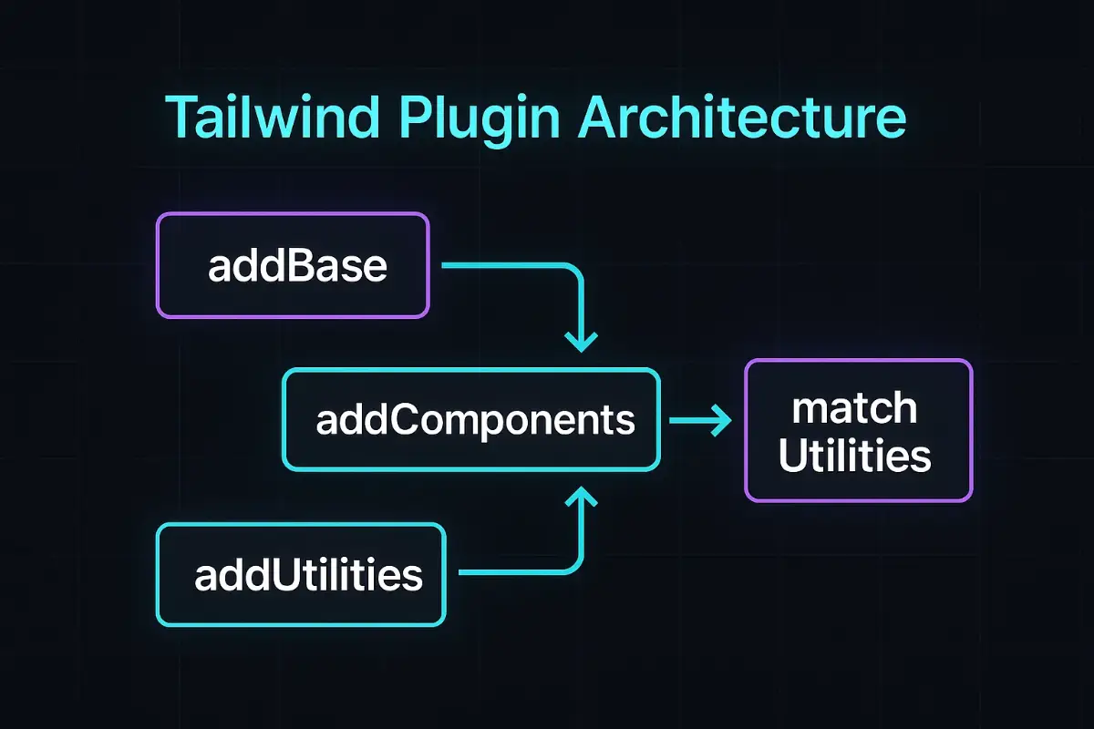
The day you write your first plugin is the day Tailwind CSS custom styles become a design system. Plugins let you inject new utilities, components, base rules, and even on-the-fly “match” utilities. Here’s the mental model and a practical template.
5.1 What a plugin can do
- addBase: tweak defaults (
h1size,codefont). - addComponents: drop in ready-made class clusters (buttons, cards).
- addUtilities: attach new atomics (
.text-shadow,.scroll-snap-x). - matchUtilities: generate utilities from values (
.rotate-y-45fromtheme('rotate')).
5.2 A complete, copy-pastable example
// tailwind.config.ts import plugin from 'tailwindcss/plugin'

export default {
content: ['./index.html','./src/**/*.{ts,tsx}'],
theme: { extend: {} },
plugins: [
plugin(function({ addBase, addComponents, addUtilities, matchUtilities, theme }) {
// 1) Base tweaks
addBase({
'h1': { fontSize: theme('fontSize.2xl'), lineHeight: '1.2' },
'h2': { fontSize: theme('fontSize.xl'), lineHeight: '1.3' },
})

  // 2) Components
  addComponents({
    '.btn': { padding:'0.5rem 1rem', borderRadius:'0.5rem', fontWeight:'600' },
    '.btn-primary': { backgroundColor: theme('colors.brand.600'), color: '#fff' },
    '.badge': { display:'inline-flex', padding:'0 .5rem', borderRadius:'9999px', fontSize:'.75rem' }
  })

  // 3) Utilities
  addUtilities({
    '.text-shadow-sm': { textShadow: '1px 1px rgba(0,0,0,.15)' },
    '.text-shadow':    { textShadow: '2px 2px rgba(0,0,0,.25)' },
  })

  // 4) Match utilities (dynamic)
  matchUtilities(
    { 'rotate-y': (value) => ({ transform: `rotateY(${value})` }) },
    { values: theme('rotate') }
  )
})

]
}
Drop those classes into JSX and you’re done—no extra imports. It’s all in your build pipeline.
5.3 Using your plugin in React
After registering, it works like any Tailwind utility. This keeps Tailwind CSS custom styles ergonomic for app teams who don’t want to memorize arcane CSS—just class names with guardrails.
5.4 Packaging your plugin as an npm module
When a pattern repeats across repos, externalize it. Create my-ui-plugin.js and export a plugin factory:
// my-ui-plugin.js const plugin = require('tailwindcss/plugin') module.exports = plugin(({ addComponents, theme }) => { addComponents({ '.btn-danger': { backgroundColor: theme('colors.red.500'), color:'#fff', padding:'0.5rem 1rem', borderRadius:'9999px' } }) }) Now reference it from multiple apps. Ship updates once. Watch consistency climb.
5.5 When to use which API (cheat-sheet)
| Goal | Best API | Why |
|---|---|---|
| Set sane defaults for tags | addBase |
Global HTML elements share styling without extra classes. |
| Ship reusable patterns | addComponents |
One class applies dozens of utilities. |
| Add one-off atomic props | addUtilities |
Minimal, explicit class names. |
| Generate classes from theme values | matchUtilities |
Scales with tokens (e.g., .rotate-y-45). |
5.6 TypeScript support (because DX matters)
You can write configs in TS for editor hints. Wrap with a helper for safe typing as shown earlier. Good typings equal fewer typos in class names and happier refactors—tiny wins that add up when you’re evolving Tailwind CSS custom styles every sprint.
6) Create responsive custom classes (screens, max widths, and friends)
Breakpoints aren’t just about stacking columns. They’re about intention. Add an extra-small breakpoint and a couple of layout caps to reduce “magic numbers” in your code.
// tailwind.config.ts (screens & sizes) export default { theme: { extend: { screens: { xs: '480px' }, maxWidth: { '8xl': '90rem' } } } } Use them like regular Tailwind variants:
<div class="max-w-8xl mx-auto px-4 xs:px-6 lg:px-8">...</div> That one extra breakpoint can make mobile cards breathe and data tables stop feeling cramped. This is the quiet power of Tailwind CSS custom styles: friction fades, consistency grows.
7) Variants with cva: ergonomic, typed component APIs
If you’ve ever copy-pasted five button flavors across files, cva (Class Variance Authority) will feel like a cheat code. It turns variants into a declarative map so your components accept a tiny, typed API—intent, size, state—and spit out the right classes.
import { cva, type VariantProps } from 'class-variance-authority'

export const button = cva('btn', {
variants: {
intent: {
primary: 'btn-primary',
secondary: 'bg-zinc-700 text-white hover:bg-zinc-600',
ghost: 'bg-transparent text-brand-600 hover:bg-brand-50'
},
size: {
sm: 'text-sm px-3 py-1.5',
lg: 'text-lg px-6 py-3'
}
},
defaultVariants: { intent: 'primary', size: 'sm' }
})

export type ButtonVariants = VariantProps
type Props = React.ButtonHTMLAttributes<HTMLButtonElement> & ButtonVariants export function Button({ intent, size, className, ...props }: Props) { return <button className={button({ intent, size, className })} {...props} /> } Result: teammates don’t memorize seven class strings; they pick an intent and keep moving. That’s scalable Tailwind CSS custom styles.

8) Optimization tips you’ll thank yourself for in three months
Ship less, name better, and keep the garden pruned.
- Trust JIT. It’s default. Keep content globs accurate to purge dead classes.
- Extract with
@apply. Promote repeated utility clusters to named classes once they settle. - Codify variants. Use
cvafor ergonomic APIs that prevent divergence. - Prefer tokens. Reach for
theme.extendover ad-hoc hex codes and one-off spacing. - Make a tiny plugin. If a pattern pops up a third time, formalize it. Your future self will send coffee.
9) Real-world patterns (copy and adapt)
These are bite-sized patterns that land well in production and keep Tailwind CSS custom styles sharp.
9.1 Accessible focus rings
@layer utilities { .focus-ring { @apply outline-none ring-2 ring-brand-500 ring-offset-2 ring-offset-white dark:ring-offset-zinc-900; } } Usage:
<button class="btn btn-primary focus-ring">New Item</button> 9.2 High-contrast mode with a single switch
:root[data-contrast="high"] { --bg: 255 255 255; --fg: 20 20 20; } @layer utilities { .bg-sys { background-color: rgb(var(--bg)); } .text-sys { color: rgb(var(--fg)); } } Flip an attribute on <html> and the entire surface adjusts—no rewrite.
9.3 Scroll-area shadows
@layer utilities { .scroll-shadow { mask-image: linear-gradient(to bottom, transparent, black 12px, black calc(100% - 12px), transparent); } } 9.4 Grid “holy grail” layout you can reason about
<div class="grid min-h-screen grid-rows-[auto,1fr,auto]"> <header class="p-4">...</header> <main class="p-6">...</main> <footer class="p-4">...</footer> </div> 10) Debugging playbook for Tailwind weirdness
When something feels haunted, it’s usually one of these. A steady playbook saves weekends and keeps Tailwind CSS custom styles predictable.
- Missing styles? Check your
contentglobs. JIT might be purging classes you’re generating dynamically. Safelist rare ones. - Dark mode flicker? Prefer
classstrategy and toggle the class early (server or inline script) before React hydrates. - Conflicting resets? If a third-party component looks off, isolate a wrapper and scope overrides with
@layer components. - Random padding? Tailwind’s
preflightcan clash with legacy CSS. Disable locally withcorePlugins: { preflight: false }then re-enable selectively.
11) Performance and SEO: small Tailwind decisions, big outcomes
Style choices influence Core Web Vitals. Less JavaScript, fewer layout shifts, consistent typography scale—the basics compound. If you’re curious about broader performance trade-offs between web stacks, our deep framework round-up is worth a skim: Fastest Web Framework 2025 – 11 Blazing Wins. It pairs nicely with Tailwind CSS custom styles because both care about shipping less, not more.
12) Security & maintainability: what future-you wants
CSS can be a security vector (think user-provided HTML). Clamp rich text in a prose wrapper from the typography plugin and sanitize on the server. Create a styles folder with index.css, components.css, utilities.css only if you truly need extra files—bloat grows fast. Conventions keep Tailwind CSS custom styles resilient when contributors change.
13) Documentation breadcrumbs your team will actually read
Pin two links in your repo README for quick decisions and references you’ll revisit weekly:
- Official Tailwind CSS docs — crisp API details, plugin guides, and recipes.
- MDN’s authoritative CSS reference — for those “what exactly does this property do?” moments.
Those are the north stars behind every strong set of Tailwind CSS custom styles.
14) Shipping to production: a checklist that saves you from 2 a.m. rollbacks
- Audit bundle. Run a size report; ensure content globs purge unused utilities.
- Exercise states. Hover, focus, active, disabled—especially for critical flows.
- Snapshots. Visual diffs for components you wrapped with
cva. - SEO hygiene. If you’re brushing up on crawl parity and bot behavior, keep your robots tidy—our Robots.txt Configuration Guide covers practical guardrails.
15) Put it all together: a mini UI slice
Here’s a tiny but complete example that threads the ideas—tokens, @layer components, a plugin utility, and cva—into a single slice.
/* index.css */ @tailwind base; @tailwind components; @tailwind utilities;

@layer components {
.panel { @apply card max-w-3xl mx-auto; }
.panel-title { @apply text-xl font-bold tracking-tight mb-2; }
.panel-desc { @apply text-zinc-600 dark:text-zinc-300; }
}
// tailwind.config.ts (excerpt) import plugin from 'tailwindcss/plugin' export default { content: ['./index.html','./src/**/*.{ts,tsx}'], theme: { extend: { colors: { brand: { 500:'#3c5cf1' } }, screens: { xs:'480px' } } }, plugins: [ plugin(({ addUtilities }) => { addUtilities({ '.card-elevate': { boxShadow:'0 12px 40px rgba(0,0,0,.08)' } }) }) ] } import { cva } from 'class-variance-authority' export const kbd = cva( 'inline-flex items-center justify-center rounded-md border px-2 py-1 font-mono text-xs', { variants: { tone: { subtle: 'bg-zinc-50 text-zinc-700 border-zinc-200', loud: 'bg-black text-white border-black' } }, defaultVariants: { tone: 'subtle' } } ) // ExamplePanel.tsx export function ExamplePanel() { return ( <section className="panel card-elevate"> <h2 className="panel-title">Keyboard Shortcuts</h2> <p className="panel-desc">Save time every day.</p> <kbd className={kbd({ tone:'loud' })}>Ctrl + K</kbd> </section> ) } That’s a slice you can ship today. It reads clearly, it’s themable, and it won’t collapse the first time someone adds a new variant.
16) Final thoughts (and a promise to your future self)
Good Tailwind CSS custom styles are boring in the best way: predictable tokens, named patterns, tiny plugins, and ergonomic variants. You’ll spend fewer hours “tweaking” and more hours building features that matter. And if Monday’s demo suddenly needs a brand refresh, you’ll smile, change a couple of values in theme.extend, and call it a day.
One last personal note: I still keep that sticky note from my Friday-to-Monday scramble. It says “repeatable, minimal, fast.” That’s the spirit I poured into this guide. Use what fits, ignore the rest, and keep shipping.
Further reading that inspired patterns here: Tailwind CSS docs, MDN CSS. If you’re building a brand-new app stack, benchmark choices thoughtfully—start with our in-depth framework comparison and keep your robots.txt healthy for search.